 FREE SHIPPING – AUSTRALIA WIDE





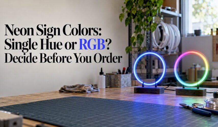
For mood lighting, choose muted warm tones; for brand visibility, pick a high-contrast saturated colour; for a quick accent, a single vivid hue almost always beats a busy mix. Soft pink and warm amber work in nearly any room, while electric blue delivers the boldest impact for events and shopfronts. The sections below cover pairing rules, room-by-room picks and the RGB versus single-colour decision.
TL;DR:
- Keep pairings within one temperature band; if you mix warm and cool hues, make one dominant, while complementary colours improve distance legibility.
- For bedrooms and weddings, use low saturation warm tones; for storefronts or distant viewing, favor saturated contrast, and test event mockups under venue lighting.
- On dark walls, use a softer white for lettering instead of pure white; on pale walls, choose deeper shades, and check glare on reflective surfaces.
- Choose RGB for promotions or event moods, but use single color for fixed branding; exact brand shade matching may be unavailable, and multicolor adds controls.
Table of Contents
- Colour basics: hue, saturation and temperature
- Colour wheel combinations that actually work for neon
- Choosing colours by space and purpose
- RGB and multicolour signs versus single-colour neon
- How wall and background colour change the way neon reads
- Practical checklist: eight rules for picking neon colours
- Durability and maintenance of coloured neon signs
- Energy efficiency and brightness by colour
- Customising colours in LED neon signs
- Design lead perspective: common mistakes and easy fixes
- How Oz Neon helps you choose and order the right colours
- FAQ
- Sources
Colour basics: hue, saturation and temperature
Hue is simply the colour itself (pink, blue, green), saturation is how intense or washed-out it looks, and these two properties decide whether a sign feels calm or demands attention. A deeply saturated hue reads as louder and more energetic, while a desaturated or pastel version of the same colour feels softer and easier to live with.
Temperature matters just as much. Warmer colours like amber, red and warm white (generally below 3,000°K) create a cosy, intimate feel, while cooler colours such as blue, teal and daylight white (typically in the 4,000 to 6,000°K range) feel crisp, modern and alert.
- Hue is the colour family; saturation is its intensity; temperature is its warmth or coolness.
- Pairing colours within the same temperature band gives a harmonious, easy-on-the-eye result.
- Mixing temperatures (red with blue, for example) works, but it needs one dominant colour or the sign starts competing with itself.
- Complementary colours (opposite each other on the wheel) create the highest contrast and the clearest legibility from a distance.
Colour wheel combinations that actually work for neon
Pairing formulas cover almost every neon brief: analogous, complementary and triadic. Each gives a different mood, and picking one before you order saves a redesign later.
- Analogous pairings sit next to each other on the colour wheel and share a temperature, which is why pink and purple, or blue and teal, look naturally cohesive on a sign.
- Complementary pairings sit opposite each other and create the strongest contrast, blue and yellow being the classic neon example, perfect when you want the sign to be unmissable from across a room or street.
- Triadic pairings use evenly spaced hues, such as teal, magenta and amber, which gives a lively, multi-tone effect without the clash you get from random colour choices.
Whichever formula you use, pick one dominant colour and treat the rest as supporting tones. A sign built around a single strong hue with muted accents reads cleanly, while several equally saturated colours fighting for attention tend to look messy rather than vibrant. If you are matching a brand palette, lean on analogous or a single dominant colour with a complementary accent rather than a full triadic spread, since that keeps the design closer to your actual brand colours.
Choosing colours by space and purpose
The right palette changes completely depending on where the sign hangs and what job it needs to do.
- Bedrooms and living areas: warm, low-saturation tones like blush, soft amber or dusty rose create a cosy glow that works as ambient lighting rather than a glare source; a muted blue or soft teal gives a calmer, cooler alternative for reading nooks or home offices.
- Weddings and events: soft warm white, blush pink or muted amber reads as elegant rather than loud, and these tones photograph well under dimmed venue lighting, so it is worth testing a mockup under the actual lighting you will use on the night.
- Bars and nightlife venues: saturated, high-contrast colours earn their keep here because the environment is already busy with other light sources, so pink, electric blue and purple cut through the noise.
- Business signage: prioritise contrast and strong saturation over subtlety, since the goal is visibility from the street or across a shop floor, and the colour should still read true to your brand at typical viewing distance.
Viewing distance changes the calculation too. A sign read from nearby inside a shop can carry more nuance than one meant to catch attention from across a car park, where a single bold hue will always outperform a detailed, multicolour design.
RGB and multicolour signs versus single-colour neon
RGB and multicolour neon signs can cycle through hues or display several colours at once, which suits events, seasonal displays or branding that changes with a promotion. A wedding sign that shifts from blush to warm white across the night, or a shopfront that switches colour for a sale, gets real value from that flexibility.
Single-colour neon, on the other hand, wins on consistency and simplicity. A static hue never drifts off-brand, needs no programming, and tends to be the easier and more reliable install.
- Choose RGB or multicolour when you need adaptive branding, event-specific moods, or a changeable display.
- Choose single-colour when brand consistency, simplicity and a straightforward install matter more than variety.
- Multicolour units generally involve more components and controls, so factor that into how much complexity you actually want to manage.
How wall and background colour change the way neon reads
The wall behind your sign changes how any colour looks almost as much as the colour choice itself. On dark walls, saturated neon colours create strong, clean contrast, but pure white text can throw off a harsh glare in that setting, so an off-white tone reads as crisper and more comfortable to look at.
On light or white walls, the same saturated hues can look garish rather than striking, so a deeper or more muted version of the colour tends to sit better against a pale background.
- Dark walls: go saturated and high-contrast, but choose off-white over pure white for any lettering.
- Light walls: go deeper or more muted to avoid an overly loud effect.
- Glossy or reflective surfaces will bounce light further than matte walls, creating a visible halo or spill, so factor that into placement.
- Always ask for a sample photo or mockup against your actual wall before committing to a final colour.
Practical checklist: eight rules for picking neon colours
Run through these steps before you finalise an order, in roughly this order:
- Decide the sign’s job first: mood lighting, an accent piece, or brand visibility.
- Pick one dominant colour that matches that job.
- Add one or two supporting colours using an analogous or complementary pairing from the colour wheel.
- Check contrast at the real viewing distance the sign will be seen from.
- Use off-white rather than pure white for text on dark walls to avoid glare.
- Stick to a single colour for consistent branding unless you specifically need a dynamic, multicolour effect.
- Request a design mockup before ordering so you can see the colours in context.
- Test the mockup against your actual venue lighting, not just daylight on a screen.
Pro Tip: Photograph your wall under the lighting you will actually use at night, then hold a colour swatch or mockup up against that photo. Screen brightness during the day can make a colour look far more muted than it will once the lights are dimmed.
Durability and maintenance of coloured neon signs
Modern LED neon signs are built to run for years with very little upkeep, but colour choice still plays a small role in longevity. Flexible LED neon tubing is sealed against dust and moisture far better than old-style glass neon, which also removes the mercury disposal concerns tied to traditional tube lighting, a benefit confirmed in the Ipswich street lighting retrofit, which found LED replacements delivered instant illumination, reduced light pollution and no mercury hazard compared with older lighting technology.
Deeper, more saturated colours and warm whites tend to show wear more gracefully than very pale or pastel tones, simply because fading is less noticeable on a colour that was already intense. Outdoor signage faces more UV exposure than indoor pieces, so colour stability over years of sun exposure is worth asking about if your sign will sit in a shop window or on an exterior wall.
Routine care is minimal: a soft, dry cloth to remove dust, and keeping the sign away from direct water exposure unless it is specifically rated for outdoor or wet-area use. Programmable controls on LED systems, also noted in the Ipswich retrofit findings, make it simple to dim a sign overnight to reduce strain on the components without switching it off completely.
Energy efficiency and brightness by colour
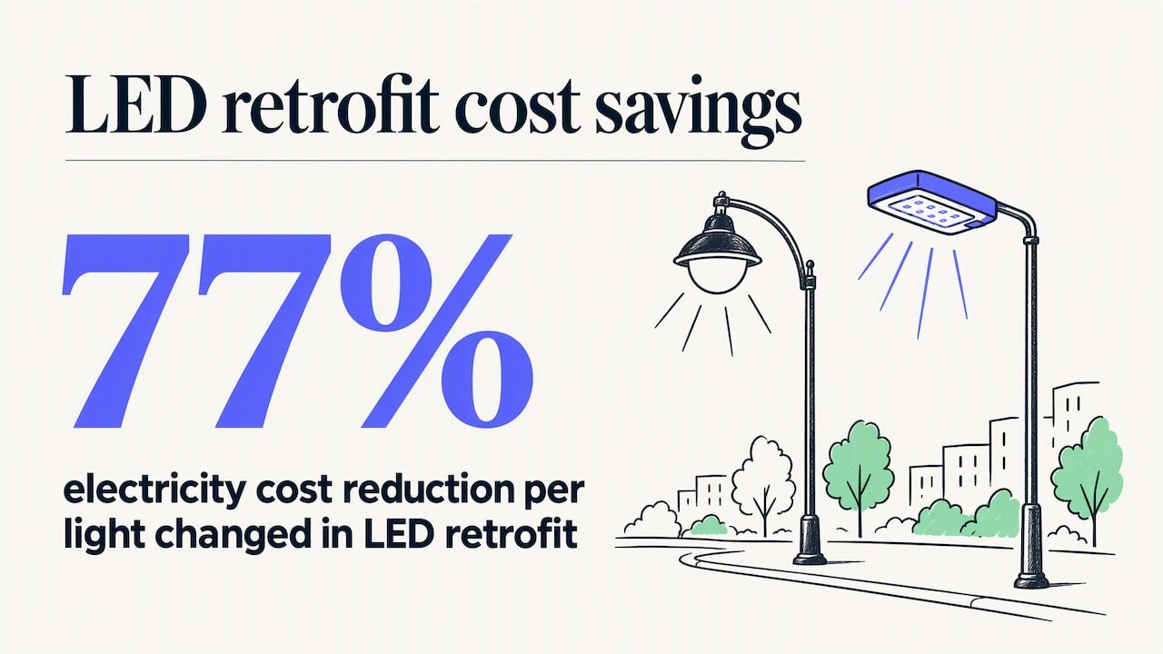
All colours of LED neon draw meaningfully less power than old gas-filled neon tubing or mercury vapour lighting, a shift documented in the Light Years Ahead lighting retrofit, which recorded a 77% reduction in electricity cost per light changed when older lighting was replaced with LED. That same efficiency principle carries over to neon signage: swapping an old tube sign for LED neon typically cuts running costs by a wide margin.
Within LED neon itself, brightness and perceived intensity vary slightly by colour because different diodes require different amounts of power to reach the same visual output. Warmer colours and whites often appear brighter at a given power draw than some saturated blues or purples, simply due to how the human eye perceives different wavelengths. This is a minor factor next to the overall efficiency gain of choosing LED over older neon, but it is worth knowing if you are comparing brightness between two colour options for the same sign size.
The Light Years Ahead findings also pointed to better colour rendering and more uniform light output as part of the switch to LED, both of which make true-to-life colour reproduction easier to achieve and maintain over the life of a sign.
Customising colours in LED neon signs
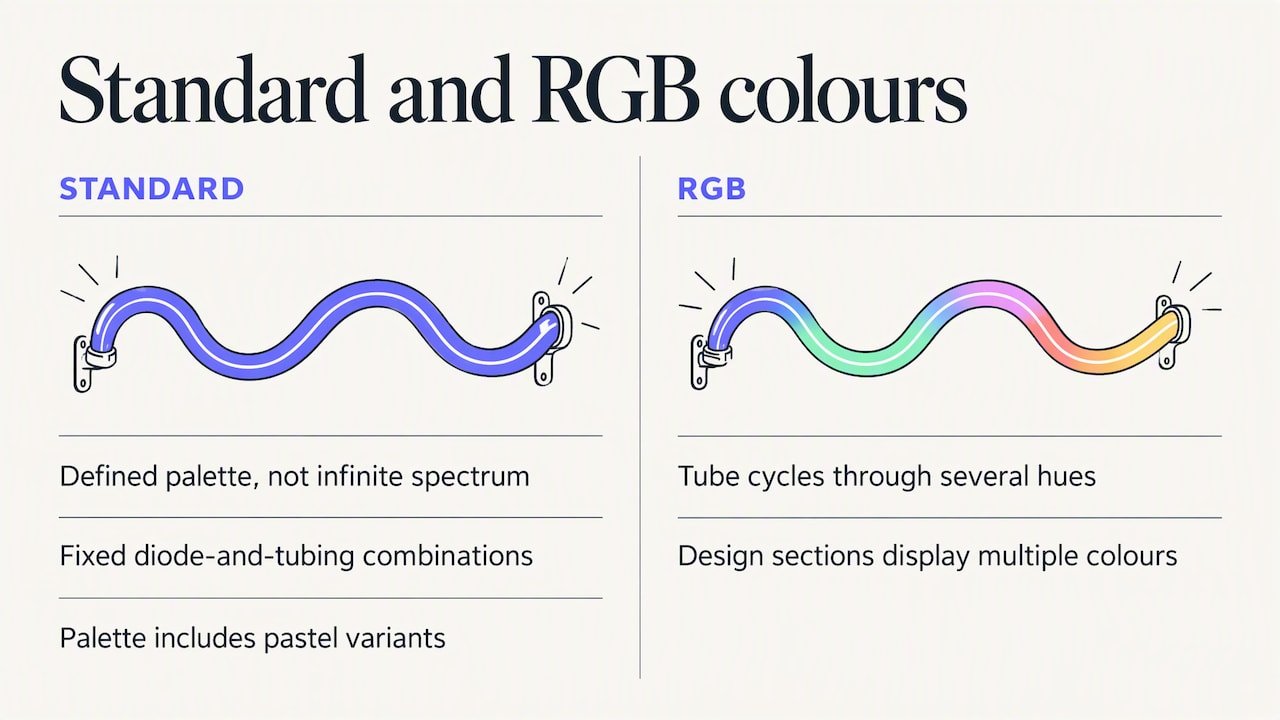
Most LED neon suppliers offer a defined palette of standard colours rather than an infinite custom spectrum, because each colour corresponds to a specific LED diode and tubing combination. Within that palette you will typically find classic neon staples like pink, blue, red, green, purple, amber and warm or cool white, along with pastel variants of several of these.
Multicolour or RGB signs widen the options further by letting a single tube cycle through several hues or display more than one colour across different sections of the design. The trade-off is that true custom colour-matching to an exact brand hex code is not always possible on every colour, since available diode colours are fixed rather than mixed to order the way paint is. If exact brand colour fidelity matters, it is worth checking which standard colour is the closest match before finalising a design, and asking for a mockup in that specific shade.
Logo-based designs add another layer, since multi-colour logos may need to be simplified to one or two dominant tones to translate cleanly into neon tubing.
Design lead perspective: common mistakes and easy fixes
The most frequent mistake is low contrast: a soft pastel sign on a pale wall, or pure white text on a dark wall that glares instead of glowing. The second most common error is piling on three or four equally saturated colours with no dominant hue, which reads as noisy rather than bold.
Both are easy to fix before you order. Request a mockup, check it against a photo of your actual wall and lighting, and resist the urge to add “just one more colour.”
— Brett
How Oz Neon helps you choose and order the right colours
We build custom LED neon signs with free design mockups, a quick turnaround and a price beat guarantee on custom quotes, so you can test a colour decision before committing to it rather than guessing from a swatch. Our catalogue already covers most of the use cases above: Just married suits the soft, elegant tones weddings call for, Oh baby works for nurseries or baby showers in warm pastel hues, and Good vibes only brings friendly, saturated colour to a living room or social space.
For bolder impact, 21, Light my fire and Let’s party show how far a single vivid hue can carry a party or event, while a compact Hand sign makes a strong accent piece for tighter wall space in bars or hallways. If none of our pre-designed pieces fit, our Build Your Own tool lets you create a bespoke design and get a free mockup before you order, so you can see your chosen palette on your actual wall before it is made.
FAQ
Can you make neon signs at home?
Building a true neon sign at home is not realistic for most people, since it requires glass-bending and gas-filling equipment and training. LED neon kits exist for small, simple designs, but for a durable, professional result most people order a custom LED neon sign rather than attempting a DIY build.
Can any colour be neon?
Most standard colours (pink, blue, red, green, purple, amber and white tones) are available as LED neon because each one corresponds to a specific diode colour. Exact custom shade-matching to a precise brand hex code is not always possible, since suppliers work from a set palette of diode colours rather than mixing colour to order.
Are neon signs expensive to run?
Modern LED neon signs cost far less to run than old-style gas neon or mercury vapour lighting, since LED retrofits have been shown to cut electricity costs per light by 77% compared with older technology. Running costs for a single sign are low enough that most buyers notice no meaningful impact on their power bill.
What do neon signs symbolise?
Neon signs do not carry one fixed symbolism, but certain colours carry common associations, such as green being linked to calmness and a sense of health in branding and retail contexts. Beyond colour psychology, neon signs are generally used to signal personality, mood or a business’s identity rather than any single universal meaning.






0 Comments for “Neon Sign Colors: Single Hue or RGB? Decide Before You Order”