 FREE SHIPPING – AUSTRALIA WIDE




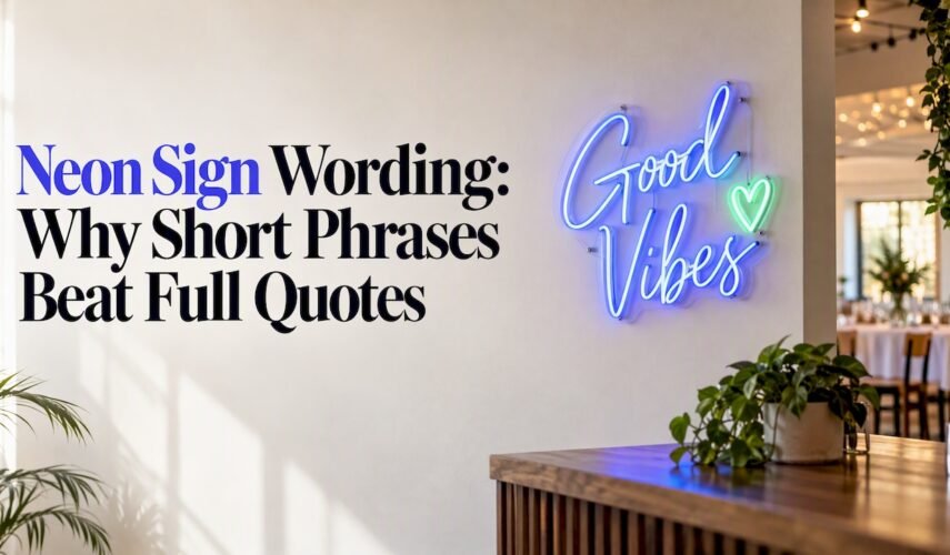
Short slogans, single bold words, wedding names and simple business calls to action work best on a neon sign because they stay legible once lit and keep their visual punch at a distance. This guide gives you ready-to-use wording for homes, businesses and events, plus the design rules that turn a good phrase into a sign that actually reads well on the wall. Custom LED neon signs can be made to fit this brief, so you will find practical ordering guidance alongside the ideas.
TL;DR:
- Keep signs to a few words; split longer wording across two lines rather than shrinking letters, and leave spacing of about 0.4 times letter height.
- For signs facing streets or entrances, use a short identifier or a three to five word prompt; doubling letter height roughly doubles readable distance.
- Internally illuminated signs generally read better at night, while flashing or animated effects reduce legibility; use no more than three colors and strong contrast.
- Replace passive labels with direct prompts such as Order here or Book now to guide customers toward a counter, booking page, or camera.
- Keep logos simple and separate from wording; a small, contrasting symbol beside or above a short phrase stays clearer than detailed artwork woven into text.
Table of Contents
- Curated wording lists by category: home, funny, inspirational and business
- Business and venue-specific wording ideas and micro-templates
- How to choose wording that reads well once it’s lit
- Design considerations for wording: fonts, colours, size and placement
- Oz Neon design process: how we refine wording into a finished sign
- Tips for choosing wording that aligns with brand identity
- Guidance on customising wording length to sign size and viewing distance
- Advice on integrating logos or symbols with wording
- Examples of wording that encourages customer engagement
- Considerations for cultural sensitivity and language appropriateness
- How to balance creativity with clarity in neon sign wording
- Brett’s edit: short slogan or decorative quote, pick the right job
- Order your custom neon sign with Oz Neon
- FAQ
- Sources
Curated wording lists by category: home, funny, inspirational and business
The right wording depends entirely on where the sign hangs and who sees it. A bedroom sign can be moody and personal; a shopfront sign has one job, which is to be read in half a second.
For home and bedroom spaces, single words and short phrases carry the most atmosphere:
- Dream, breathe or wander work as single-word mood pieces for a bedroom or reading nook.
- Stay awhile and home sweet home suit entryways and living rooms.
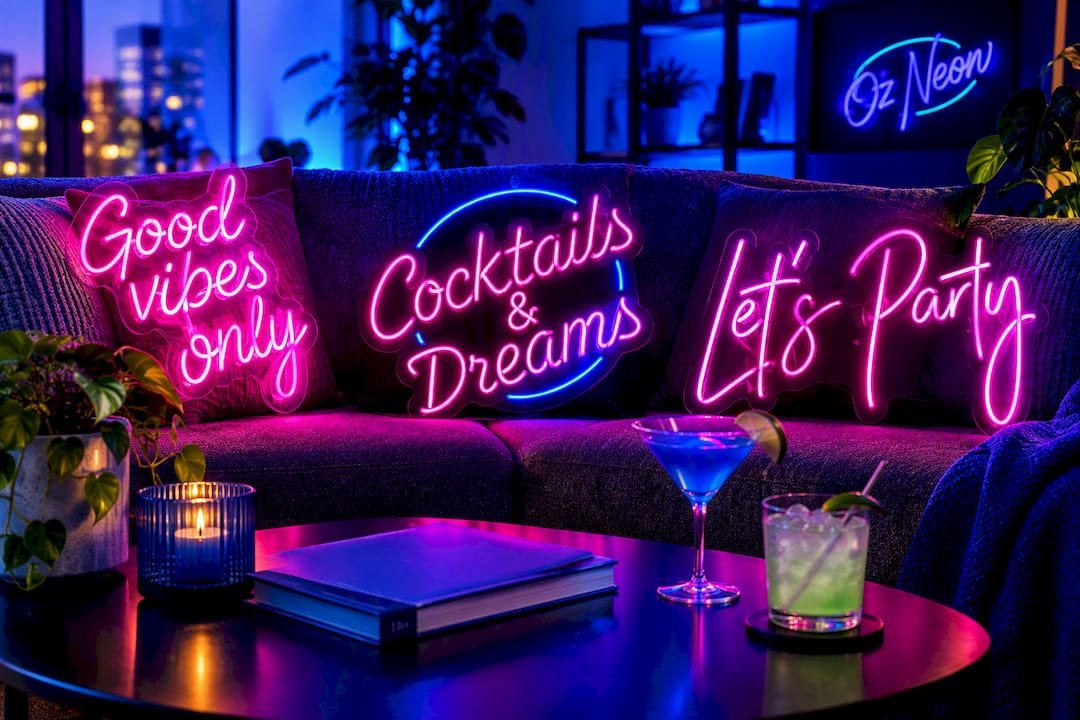
- Good vibes only is one of the most requested wall art phrases for lounges and share houses, and we offer it as a ready-made design.
Funny and cheeky lines lift a kitchen, bar cart or home bar without trying too hard:
- But first, coffee for a kitchen bench.
- Cocktails & dreams for a home bar, also available as a finished sign.
- Tequila mockingbird or wine a little as cheeky one-liners near a drinks trolley.
Inspirational and romantic quotes read best trimmed hard, down to two to five words rather than a full sentence:
- Chase the sun.
- Love wins.
- Together is a beautiful place.
Business wording works as a micro-template you personalise rather than a slogan you invent from scratch. A café might run Open • Coffee, a bar might run Bar • Tonight: Jazz, and a boutique might simply name itself. Browse our bar sign and general neon sign categories for live examples of how these read once built.
Event and party wording tends to follow two patterns: the couple’s or host’s name paired with a date, or a one-line prompt that sets the mood for photos. Let’s party covers almost any celebration and is one of our ready-made signs, while personalised name-and-date combinations suit weddings and engagements, shown in our personalised sign range. For hens’ nights, birthdays and launch parties, our event signage category shows how short prompts like Say cheese or Let’s celebrate perform once lit.
Business and venue-specific wording ideas and micro-templates
A venue sign needs to do a job in under a second: tell people what the place is, what’s happening, or where to look. These templates are built to be swapped and personalised:
- Cafés: Open • Coffee or Fresh brew daily.
- Bars: Bar • Tonight: Live Music or Happy hour.
- Retail stores: New arrivals or just the shop name as a single word.
- Salons: Blow dry bar or Hair • Beauty.
- Restaurants: Eat. Drink. Repeat.
- Studios: Book now paired with a logo mark.
- Pop-ups: Grand opening.
- Takeaway counters: Order here.
Tone should follow the venue’s personality: a wine bar can afford a cursive script and a softer phrase, while a gym or barber needs blocky, high-contrast lettering and a short, direct line. A single word, used as an identifier or mood setter, often outperforms a longer tagline because it reads instantly from the footpath and doubles as a photo backdrop. For bespoke commercial signage, our business sign service adapts any of these templates to your brand’s colours and layout.
How to choose wording that reads well once it’s lit
Wording that looks fine on a screen can fall apart once it’s built in tubing and mounted on a wall. A few rules keep that from happening.
- Keep most messages to a few words; shorter phrases are recognised faster and hit harder from across a room.
- Split a longer phrase across two lines instead of shrinking the letter height to fit one line.
- Leave minimum letter spacing of about 0.4 times the letter height, a common fabrication guideline that stops letters appearing to touch once illuminated, as outlined in WorkSafe Queensland’s electrical safety guidance.
- Favour internally illuminated and neon-style signs over externally lit ones: sign legibility research finds they generally read better at night, while flashing or animated illumination reduces readability.
- Talk to your installer about voltage and compliance before finalising wording length, since layout affects wiring; the national CPCCSG3011 competency unit covers the checks installers run before handover.
Pro Tip: Write your phrase in block capitals at the size you intend to build it, then step back ten paces. If you squint to read it, cut a word.
Design considerations for wording: fonts, colours, size and placement
Font choice decides whether your wording survives translation into tubing. Avoid intricate script or heavily decorative typefaces for anything functional like opening hours or a call to action; save flourish for a single short word or a backdrop piece. A simple sans serif or a restrained, open script keeps short phrases crisp.
- Limit the palette to three colours or fewer, and prioritise strong contrast between the letters and the wall or background behind them.
- Size wording to its viewing distance: a sign read from across a room needs smaller letters than one meant to be seen from the street.
- Letting wording occupy too much of the sign face crowds the design and hurts legibility, even when the phrase itself is short.
- Skip flashing or animated effects: they reduce legibility and can run into local signage rules, according to the same sign legibility research.
Oz Neon design process: how we refine wording into a finished sign
Once you’ve landed on wording, we turn it into a tailored mockup that adjusts spacing, line breaks and colour before anything is built, so you see exactly how the phrase will read when lit. Our quick turnaround means you’re not waiting weeks to approve a design. Experienced teams have helped business clients see improved foot traffic and stronger event engagement from well-placed signage. On installation, awareness of competency standards like CPCCSG3011 means your sign is handled with the right electrical checks in mind.
Tips for choosing wording that aligns with brand identity
Wording should sound like your business, not like a generic sign shop template. Start with the words your customers already use to describe you: if your café is known for being cosy, warm and welcome fits better than a generic open sign.
Match tone to register. A premium boutique reads better with a restrained single word or a short, elegant phrase than with a pun. A casual burger joint can lean into humour because that mismatch between a serious font and a cheeky line rarely works in either direction.
Keep wording consistent with your other brand touchpoints. If your logo uses a bold, geometric typeface, your neon wording should echo that weight rather than switching to a thin script that fights the rest of your signage. Consistency here helps customers recognise the sign as yours before they’ve even finished reading it.
Finally, test the phrase against your brand in writing before committing to a layout. Say it out loud, picture it on your shopfront or wall, and ask whether a stranger walking past would connect it to your business without needing the logo next to it. If the answer is no, the wording needs trimming or a rewrite, not a fancier font to compensate.
Guidance on customising wording length to sign size and viewing distance
The distance between your sign and the people reading it should decide both the wording length and the letter size, in that order. A sign mounted behind a bar, read from a few metres away, can carry a slightly longer phrase at a modest letter height. A shopfront sign meant to be read from across a street needs shorter wording and noticeably taller letters, because there’s less time to take it in.
As a working principle, longer viewing distances call for fewer words, not just bigger letters. Doubling the letter height roughly doubles the distance a sign can be read from, so if your wall space is fixed, trimming the phrase is often the only way to keep letters legible at the distance you need.
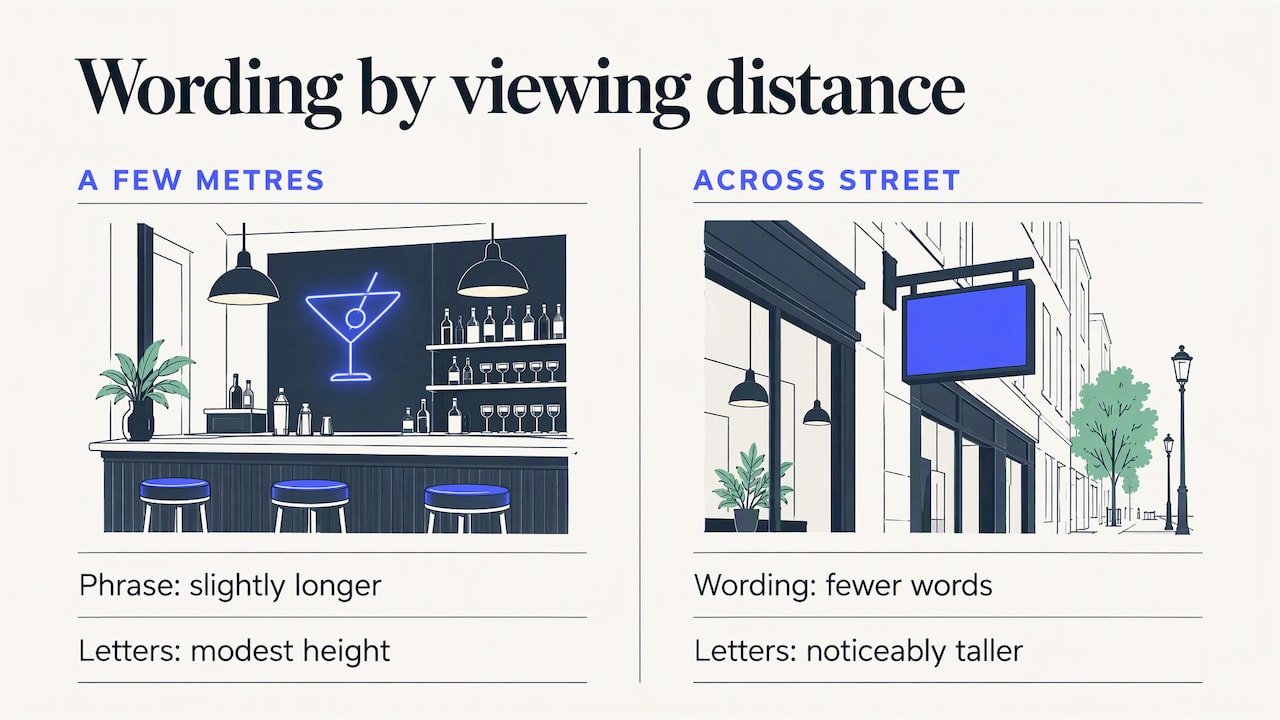
For small indoor spaces like a bedroom or home bar, a longer personal phrase or a name-and-date combination works because readers are close and have time to look. For anything facing a street, a car park or an event entrance, cut the wording back to a short identifier, a single word or a three to five word prompt, and let the size of the letters do the rest of the work.
Advice on integrating logos or symbols with wording
A logo or symbol paired with wording can anchor a sign and make it instantly recognisable, but the two elements need to support each other rather than compete. Keep the symbol simple: an intricate logo loses its shape once rendered in tubing, so a simplified or outlined version of your mark usually translates better than the full detailed version used on your website.
Position matters as much as design. Placing a small icon or logo mark beside or above a short word, such as a coffee cup above Open, works better than trying to weave a symbol into the middle of a sentence. Treat the symbol as a separate visual element with its own breathing space rather than squeezing it between letters.
Colour the logo distinctly from the wording where possible. A contrasting colour helps the eye separate the two elements and read each one clearly, rather than blending them into a single busy shape. If you’re submitting your own artwork, our logo and image upload process lets our design team adjust the balance between your symbol and your wording before anything goes to production.
Examples of wording that encourages customer engagement
Wording that prompts an action tends to outperform wording that simply states a fact. Instead of Coffee, a phrase like Order here or Fresh brew daily gives the customer something to do with the information.
For retail and hospitality, short direct prompts work well: Shop now, Book now, Say cheese near a photo wall, or Tag us beside a social handle. Each of these turns a passive sign into a small nudge, whether that’s toward a counter, a booking page or a camera.
For events, engagement-focused wording often doubles as a photo prompt. Let’s party, available as one of our ready-made signs, works as both decoration and an invitation to join in, which is part of why phrases like it are reused across weddings, launches and birthdays. The common thread across all of these examples is brevity paired with a verb: tell the reader what to do, in as few words as possible, and let the sign’s glow do the rest of the persuading.
Considerations for cultural sensitivity and language appropriateness
Wording that reads as playful in one context can land badly in another, so it pays to check a phrase from a few angles before committing it to a sign. Slang, religious references and phrases borrowed from a culture outside your own are the most common sources of unintended offence, particularly on signage meant for a broad public audience rather than a private room.
If your sign will be visible to the public, run the wording past someone outside your immediate circle, ideally someone from a different background, before finalising it. A phrase that feels harmless among friends can read very differently to a stranger walking past a shopfront or scrolling past a photo of your event.
Avoid wording that relies on a pun or double meaning in a language you don’t speak fluently, since translation tools can miss context, tone or an unintended second meaning entirely. For business signage in particular, keep wording inclusive and avoid phrases tied to one narrow group’s references if your customer base is broader than that group. When in doubt, a simpler, more universal phrase is almost always the safer and more effective choice.
How to balance creativity with clarity in neon sign wording
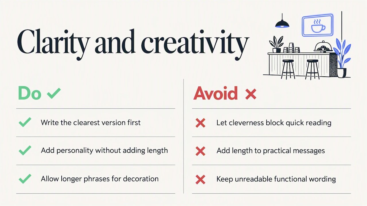
The tension in almost every neon wording decision comes down to this: a clever phrase that nobody can read quickly has failed at the one job a sign has. Clarity should set the boundaries, and creativity should fill the space inside them.
Start with the function. If the sign needs to communicate something practical, such as opening hours, a call to action or a brand name, write the clearest version of that message first. Once that core line is locked in and legible, look for a way to add personality through word choice, a single unexpected word, or a touch of rhythm, without adding length.
Creativity has more room to breathe when the sign isn’t carrying operational information, such as a decorative piece for a feature wall or an event backdrop. In those cases, a slightly longer or more stylised phrase can work because the reader isn’t relying on it to find a door or place an order. The simplest test is to ask what happens if someone can’t read the sign from across the room: if that’s a real problem, trim the wording; if it’s purely decorative, the creative version can stay.
Brett’s edit: short slogan or decorative quote, pick the right job
Function wins for wayfinding, hours and calls to action. Vibe wins for event backdrops and photo moments. Either way, test the phrase at full scale before you approve it.
— Brett
Order your custom neon sign with Oz Neon
Once you’ve settled on wording, turning it into a sign is simple: pick your phrase, request a free design mockup, and approve the layout before we build it. Pricing is kept affordable without cutting corners on craftsmanship, with custom quotes backed with a price beat guarantee and local Australian support offered throughout the process.
- Choose or personalise your wording using the ideas and rules above.
- Submit it through our Build Your Own tool or upload your own logo for a tailored mockup.
- Approve the free mockup, then we handle production and support through to install.
Browse our full range of LED neon signs and wall art to see finished examples before you start your own design.
FAQ
What sound do neon signs make?
Traditional glass neon tubes can produce a faint buzz or hum from the transformer, which some people notice in a quiet room. LED neon signs, which is what we build, use solid-state LED strips rather than gas-filled tubes, so they typically run silently.
What are some words related to “neon”?
Common related words include glow, tube, illuminated, fluorescent, LED, signage and backlit, all of which describe either the light source or the finished effect. “Neon” itself originally referred to the gas used in traditional tube lighting, though modern “neon signs” are now most often made with flexible LED neon rather than glass tubing.
How do I make a neon sign at home?
Small LED neon kits and flexible LED strip rope exist for simple home projects, but getting clean letter shapes, even illumination and safe wiring is harder than it looks once you move beyond a single word or simple shape. For anything meant to last, read well from a distance, or meet basic electrical safety expectations, a custom-built sign from a dedicated supplier is the more reliable route.
What do neon signs mean?
A neon sign’s meaning comes entirely from its wording and context rather than the format itself: a single word like Open communicates availability, while a name and date mark an event or milestone. Historically, neon signage became associated with nightlife, hospitality and advertising because the glow stood out at night, and that association still shapes how people read neon-style signs today.
How many words should a neon sign have?
Most legible neon signs sit between three and eight words, with shorter phrases easier to read quickly from a distance, according to sign legibility research. If a phrase runs longer, splitting it across two lines preserves readability better than shrinking the letters to fit one line.
Sources
- CPCCSG3011 Install LED technology into signs — National Training Register
- Illuminated sign conspicuity: what factors make a sign noticeable and legible — Sign Research Foundation



0 Comments for “Neon Sign Wording: Why Short Phrases Beat Full Quotes”