 FREE SHIPPING – AUSTRALIA WIDE




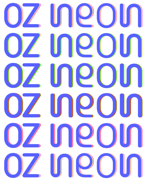
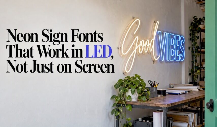
For neon sign fonts, choose monoline scripts for close-view decoration, geometric sans-serifs for modern brand signage, and bold condensed displays for storefront legibility. Tilt Neon is a neon-specific specimen worth studying, and we build finished signs from these styles at Oz Neon. Sizing and licensing guidance follows straight away.
TL;DR:
- Size letters by viewing distance: roughly 1 inch per 10 feet; use 2–4 inches indoors and 8–12 inches for storefronts viewed from pavement.
- Before fabrication, preview the font as a single weight line, check open counters and joins, and ask your fabricator about minimum bend radii.
- Pair one script headline with geometric sans subcopy; avoid two scripts at the same scale, and choose strong contrast because light walls weaken the glow.
- Check manufacturing rights before fabrication, since desktop or personal use licenses may not cover signs; Montserrat and Bebas Neue use the SIL Open Font License.
Table of Contents
- Which neon sign fonts suit your sign?
- What makes a font neon-friendly in practice?
- How do you pair fonts and pick colours that read well?
- Where do you get neon fonts, and what licence do you need?
- A quick commissioning checklist from Brett
- Ready-made neon styles and a custom build option from Oz Neon
- FAQ
- Sources
Which neon sign fonts suit your sign?
The best neon sign fonts share one trait: they can be bent from a single continuous tube without losing clarity. Practitioner lists such as this roundup of neon fonts pick fonts for stroke consistency and manufacturability, not just looks. Here is a shortlist, grouped by style.
Script
- Pacifico: a rounded, friendly script for cafés, wedding backdrops and retro bars. Keep it at a size where the loops stay open.
- Bayshore: a flowing brush-style script for bars and lounges. It suits close viewing, so avoid very small sizes.
- Scriptina: an elegant, formal script for weddings and boutiques. Its thin joins need simplifying before bending.
Geometric sans
- Montserrat: open-licensed and clean, a safe pick for modern brand signage and interior walls.
- Gotham and Helvetica: familiar, even-weight sans-serifs that read well in offices and shopfronts.
- Avant Garde Gothic: near-perfect circles make a distinctive, fashion-led look for studios and salons.
Condensed and display
- Bebas Neue: an open-licensed condensed sans and a storefront favourite. Tall, narrow letters stay legible from the footpath.
- Sign Painter: a hand-lettered feel that suits hospitality and retro themes.
- Blockbuster: a heavy display face for bold, playful statements. Use it large, as tight spaces can merge in the glow.
Double-line and novelty
- Tilt Neon: designed to echo neon tubing, with variable rotation axes limited to ±45° so legibility is always kept.
- HT Neon: a monoline neon-style face presented by Adobe Fonts, handy for checking how a tube-like alphabet should look.
What makes a font neon-friendly in practice?
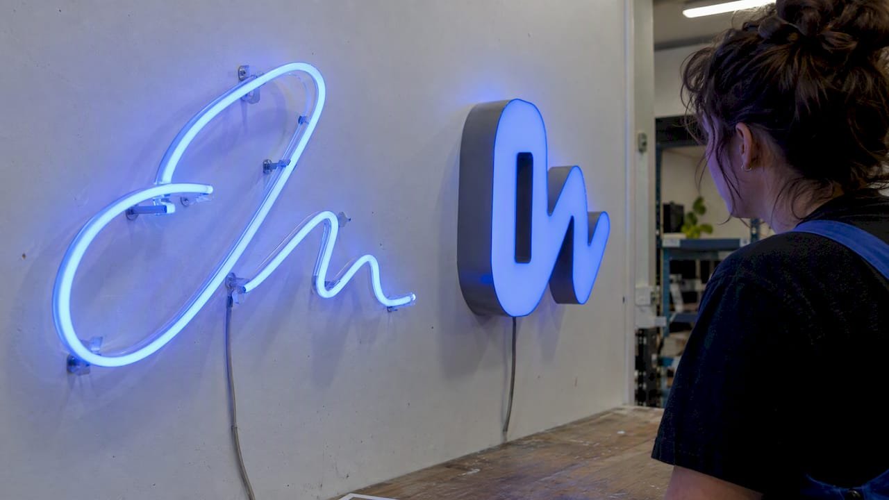
Neon is built from one tube path, so the font has to cooperate. Andy Clymer, designer of the Tilt family, notes that LED neon flex allows new typographic approaches, but traditional principles of few strokes and monoline forms still give the clearest result.
Rule of thumb: roughly 1 inch of letter height per 10 feet of viewing distance, with 2–4 inches standard for small rooms and 8–12 inches for storefronts seen from the pavement.
That means a café wall viewed from 15 feet is comfortable at 2–4 inches, while a shopfront read from across the street needs the upper end of the storefront range or more.
Red flags to watch for:
- Hairline strokes that glow into a blur
- Tight counters (the enclosed space in letters like “e” or “a”) that fill with light
- Ornate serifs and decorative flicks that need extra tubes
To test a font before committing:
- Preview it as a single-weight line at your target size.
- Check counters and junctions for spots where strokes touch.
- Confirm the licence allows manufacturing, not just desktop use.
- Ask your fabricator about minimum bend radii for sharp turns.
Pro Tip: Round off sharp corners and thicken or remove hairline connectors before you send artwork. A slightly simplified letter often looks better lit than a faithful copy of the original.
How do you pair fonts and pick colours that read well?
Pairing rules for neon are stricter than for print, because every extra stroke is extra tubing and extra glow.
- Script plus geometric sans: let the script carry the headline and the sans handle subcopy.
- Bold display plus simple subcopy: a heavy headline with a thin-but-clear line beneath keeps hierarchy obvious.
- Avoid two scripts at the same scale. They compete and the glow muddies both.
Colour comes next. Choose strong contrast between the lettering and the wall. Warm amber suits a retro feel, pink suits soft event settings, and cool white looks modern and crisp. A light, reflective background makes the glow look weaker, while a dark matte wall makes the same colour appear brighter.
On finish, a tube-only look shows every letter shape as drawn, so delicate scripts shine there. Halo or face-mounted styles favour bolder, simpler letters, because the shape is read as a silhouette as much as a line.
Where do you get neon fonts, and what licence do you need?
Licensing trips up more neon projects than bending does. Many free-download sites supply fonts for personal use only. FontSpace’s own help explains that personal licences cover things like invitations for friends, while any project meant to make a profit needs explicit authorisation. Open-licensed fonts under the SIL Open Font License, such as Bebas Neue and Montserrat, are generally free for commercial use.
- Check the foundry’s licence agreement for manufacturing or product-embedded rights before fabricating a physical sign. A desktop licence does not automatically cover signage.
- Know the categories: foundries such as Ivy Foundry separate web, app and desktop licences, and bespoke or manufacturing use may need a separate arrangement.
- Start with open options like Tilt Neon and other OFL fonts, and buy from reputable vendors or directly from the foundry when in doubt.
A quick commissioning checklist from Brett
Put legibility first, brand tone second, then materials and budget. Confirm the size against your viewing distance, pick a colour that contrasts with the wall, and check the font licence before you pay for anything. Then ask for a mockup: we offer free design mockups and a tailored design process. If a font has fine details, ask your fabricator to adapt it for neon rather than forcing it.
— Brett
Ready-made neon styles and a custom build option from Oz Neon
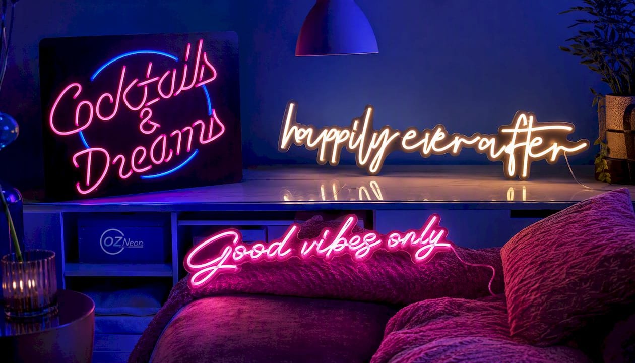
If you would rather skip the font hunt, these are good places to start in our LED neon range:
- Cocktails & dreams: for hospitality and event signage.
- Good vibes only: for casual interiors and bar installations.
- Happily ever after: for weddings and backdrops.
- Build Your Own: for bespoke text or logos.
Request a free mockup or upload your logo and we will come back with pricing and turnaround. Business owners can also see our custom signs for businesses.
FAQ
What are the best fonts for neon signs?
Script fonts like Pacifico, geometric sans-serifs like Montserrat, and bold condensed faces like Bebas Neue can suit neon signs. Choose a typeface with strokes and shapes that can be adapted for fabrication.
Is there a neon font in Canva?
Canva offers many neon-style fonts, but font vendors note that desktop licences often don’t allow uploading font files to hosted services without explicit permission. Check the licence before using any font for a physical sign.
What are some good free fonts for neon signs?
Tilt Neon, Bebas Neue and Montserrat are open-licensed choices, which makes them safer than random free downloads. Many free-font collections, including neon categories on FontSpace, include personal-use-only licences.
How do you make a font look like a neon sign?
Use a monoline font with open counters and few strokes, then give it a glow in your design software. Tilt Neon was designed to mimic neon tubing and is a handy starting point.
Sources
- [Tilt Neon — Variable Font Specimen &
OpenType Features](https://www.csstypestudio.com/library/font/tilt-neon) - Fontspace
- The Best Fonts for Neon Signs
- Tilt Neon – Google Fonts



0 Comments for “Neon Sign Fonts That Work in LED, Not Just on Screen”